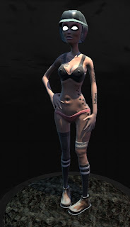
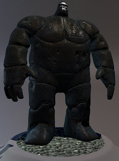
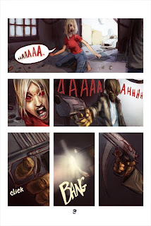
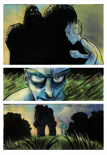
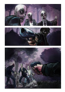
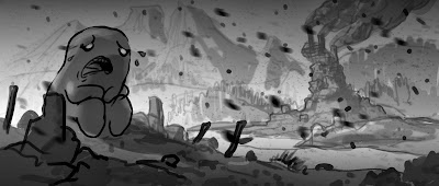
So I am fooling around with design and composition. At the very least I am trying to wrap my head around it better.
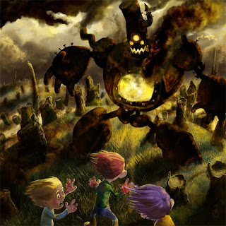
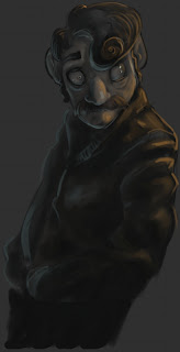
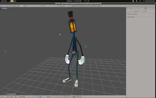
For some reason I seem to be up against a brick wall with the Lampy short, and so I've been working on other things as an escape from the circles in my thought process.
I just can't seem to make up my mind on where to take it. I
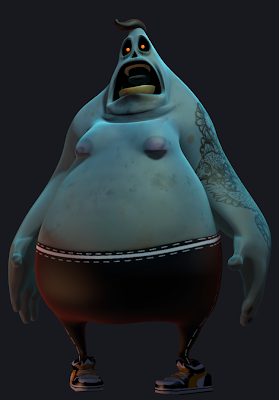
could just go ahead and create a silly action short that consists of a fight between Lampy and Bubba, but I don't feel that I would be very faithful to the world that I am trying to create for them, and I doubt anyone would even take notice.
There is a deeper experience to Lampy that I would like to bring out. It's not immediately apparent on the surface, but I think that it is worth striving towards.
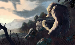
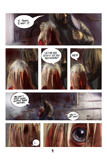
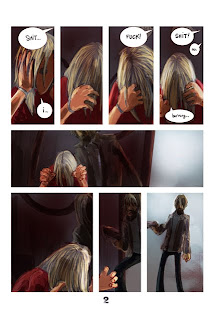
As for the werewolf graphic novel(OH! hoity toity), I think these little exercises will help get me into a frame of mind over time to help me tackle that story better too.
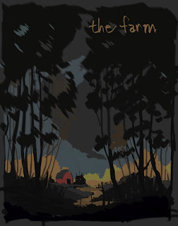
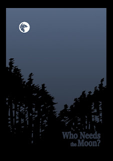
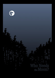
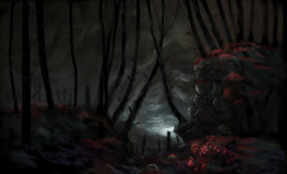
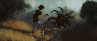
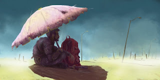
These following two images are poster doodles.
I was just blocking out strokes on the computer - hoping something interesting would pop out that I could pounce on and take somewhere.
This is what came about of that. I didn't bother with any kind of standardized poster size. Maybe these look more like old book covers. At least that is what I am starting to see while posting this.
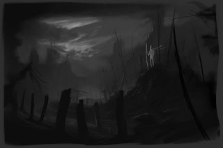
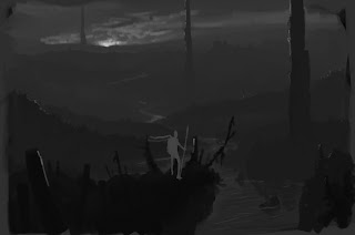
These two "thumbnails", or at least what started out as thumbnails, were me working through the FPS ideas that have been floating around in my head for some time.
Again not really trying to do accomplish anything except rip something creative out of my head.
I stuck with gray scale in these images because I didn't really want the hassle of trying to figure out colours. To be honest I think my eye for colour can be somewhat lacking, so this was really an exercise in composition, dramatic tone and narrative.
These were all done using the super awesome, free and open source painting program called
MyPaint.


