Tuesday, March 27, 2012

Break time - Sculpting Digital Clay

So I've recently felt that I needed to give the comic some time to simmer.

If you fool with something too long - as I am wont to do - you can seriously mess twist and warp a good idea into a bad one.

When working on personal projects I have this nasty habit of over tweaking ridiculous details that bring nothing to the table to improve the work in front of me. Later, when I am starting to get pressed for time, I rush things and find myself disappointed with the end result.

I do not intend to do the same thing with any of my projects in the future. I will take the time - sure -  to do it right. But, from now on, I will write things down, make well laid plans and ensure that the end product is hopefully good to someone else other than me.

So anyways, I have been fooling with Sculpting in Blender again. In the future, I will be getting into a few animated projects that I think will have quite a few models and objects that make use of sculpting.  So I plan on using some of my time every once and I while to dedicate to focusing on a few areas in 3D that need practise. Maybe even fool with some film here and there.


Proportionately, these heads aren't very accurate - no reference was used - and they could use some even finer details, which I might add later. Never mind the ears, I almost ignored doing them, focusing instead on the faces.  Mainly, these quick sculpts are meant to make me more familiar with all the sculpt tools  that are now available in Blender.


Currently I am only skimming the surface of the tools, making use of the default settings mainly, but eventually I hope that I have a formula that works well with me that I can use effectively to create great looking models.

In the last few releases, Blender has really improved in the areas of sculpting. Some great features have been added in to the program, and some others just down the pipeline. With Google Summer of Code soon to start it will be interesting to see what else gets added to an already fantastic program.

Wednesday, March 14, 2012

Monitor Calibration Horror.

I've been trying today to calibrate my pretty cheap monitor.

The worst thing about doing this now, is that the current settings that I have set up right currently, show me that a lot of the past work that I have been doing is pretty poor in contrast.

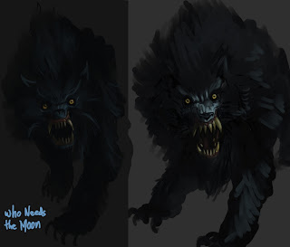
The previous post's image of werewolves concepts is a pretty good example of that.  Here's the problem, on my monitor before calibration it looks fine.  Obviously, I painted it in that environment. On my smartphone, a Nexus S, it looks fine, ignoring a few problematic high contrast areas.

On the newly calibrated monitor  though -  which I think is better than before, but far from perfect - it is barely visible and hard to make out.  As a test, I brought the image into the GIMP and tweaked the Levels, Brightness/Contrast and Curves as well. It appears better on my screen now, but shows that as a concept piece it is kind of weak.

When getting into an extremely dark piece like this, and this is probably true of extremely bright pieces as well, cheap screens just aren't calibrated properly and give a poor range of blacks and whites.  Graphics people shouldn't cut or skimp on monitors if they can afford not to.


I am going to have to fool with this monitor setup more and see where I can compromise. I just hope this doesn't ruin all my work. 

If you feel that you could benefit from some eyeball calibration of your monitor, here is the link
that I used to tweak my NVIDIA settings.

P.S. to all of you that have viewed my work on a properly or semi-properly calibrated monitor, I apologize.

Wednesday, March 7, 2012

Sympathy for the Devil


Well, it has been difficult to find time to work on anything related to the graphic novel, let alone any other type of art.

Currently, with my wife working her way through chemo therapy to fight breast cancer, I find that the whole family is strapped for time. Because of this my duties have increased taking care of the house, her and the kids and so I don't have much time for anything else.  When I do have some time at night, I find myself completely exhausted.

Right now I am REALLY tired. I've never been this tired. @_@

For a while there, early into her treatment, art seemed pretty trivial, when faced with the all the things cancer heaps on a family. Naturally I guess I've shied away from it, and so things have been left by the wayside. Probably for the better. I've stewed on design and story ideas.

Lately though, I've been making a more serious attempt to do something... anything. I really want to create this book.

Anyways.

I was never entirely comfortable with the look of the werewolf.  An American Werewolf in London's creature effects has had a huge influence on my design ( I love that film ) but I want to inject my own take and style on it. These concepts come from me trying to nail down something.

The whole character of the wolf needs fleshing out. And the town too.

More to come. I hope.