Hi there. I have something that may be of use to some of you out there.
Here is the TEMPLATE.
Tonight I have started working on the layout of the first 25 pages of my book Who Needs the Moon.
Once it's ready I will be putting it online here for you to read in the new page that I will be opening up soon on this blog.
To create the book, I will be using Inkscape to do all the borders, speech balloons and text for the comic. I think I have found a document size that works well for printing, and which can be shrunk down in order to be placed on the internet.
If you want a comic template to use, you can use this one until your hearts content and not have to worry about paying a fee to me or giving me credit.
I hope it saves you some time.
As I work on the book more, I'll add things as I need them and will update the file and link.
NOTE: The values of the template were sort of arbitrarily chosen. It is sort of a mix of industry sizes. I mainly measured out sizes from different graphic novels that I liked and then chose one for myself. This is not a template that conforms to marvel/DC or Manga standards.
Thursday, June 28, 2012
Wednesday, June 27, 2012
MOR EGG comic - What happened?
I did the art for this book, and worked on it for an incredibly dirt cheap price. Dirt! Cheap!
It was a good experience, in that it taught me about how a book needed to flow, and ways that I could plan ahead in my own personal work.
I haven't heard much about it, from the writers over the years. So I assume that it hasn't faired all that well.
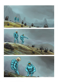
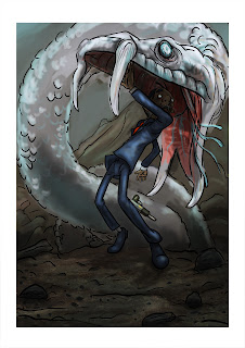
I've posted some examples of the pages I illustrated without any word bubbles.
One BIG thing I learned from this, was that there is a huge amount of work that goes into pencilling, inking and colouring a book. If you go down this route on your own, you had better be prepared for a lot of time spent in front of whatever it is you'll be working with. Be it monitor, paper or... er... playdoh?
Overall, I was happy with the way my work turned out. I really tried to put in to practice many things that Scott McCloud discussed in his book Understanding Comics.
Zombie Concept Dump
I've decided that I just need to fill out this blog a little better with art that has been done while I was working for past companies.
This dump consists of concept sketches that were made for zombie enemies that were used in a game that was the protoype that later became - Land of the Dead: Road to Fiddler's Green. I worked on this game while working for BrainBox which is now a dead division of Digital Extremes.
These were made 9-10 years ago I think.
Tuesday, June 26, 2012
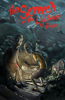
The Screech of the Lighthouse Keeper
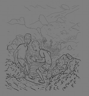
So I wanted to practice and work on my inking in MyPaint some more. So I started a quick doodle which led to this...
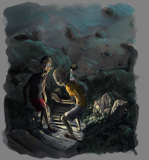
It ended up as a scene from some kind of teen mystery novel or comic, which I think was influenced by my love of horror films, but probably a likely result of watching Scooby-Doo! Mystery Incorporated a week ago. After working on it some more, on and off over a period of a couple days, I finished with the above cover idea.
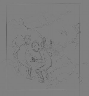
Here is the process I used in MyPaint. I made a quick rough - with a brush that I think finally feels like a 4B pencil - that sketched out the composition of the scene. I wasn't all that sure if I would continue to work on it past this point, since it was actually originally intended as a way to get warmed up.
Something in it captured my eye - I think it was my surprise at the way the brush behaved - and so I decided to continue working on it. I next grabbed one of the ink brushes that I have been tweaking and tried to get a sense of the method I would like to use. I like to add detail with the "ink" instead of working it out in the rough, because I can quickly undo anything I don't like.
My intention was to start spotting blacks, but I realized that this wasn't probably the best choice for the image. Not to say that it wouldn't have worked - it would have ended up looking very different than this though - I just think that at this point I saw it for what it was and felt that it should be treated in a way that befitted it. A teen mystery story cover. So I started instead to block in colours and lighting. I was looking for a moonlit feeling of foreboding. I also thought that I should add in some hard highlights and decided that I would need to paint in some flash lights.
Next step was to tweak the image more by adding more visual interest. I didn't want to over complicate things here. Which I may have done anyhow.
At this point I once again decided that I should do something that I have been consciously trying to steer myself away from. Post. But once again I felt that the image needed it for what it was. So I took it into the GIMP and cropped it. I then added some new layers that I used to add overlay and multiplied colouring. And it was done. I took it back into MyPaint after this step and drew in the title and cropped it again, because the app likes to add more canvas dependant on brush stroke.
I actually had a lot of fun with this, and learned a lot from it.
Monday, June 25, 2012
Wednesday, June 20, 2012
Videos of Padworx Apps
I've been meaning to get work I've done for companies in the past posted here to the blog. Unfortunately, when my work is done on a project, it usually has a few other channels to go through, so it's not ready to be shown when I want to post it, and then I forget about it. Today however was a good reason to post teaser videos of the apps that I worked on while at Padworx Studios.
I was very happy with how my work turned out in the Puff app. There were quite a few limitations on the meshes and skeletons that were later exported into the engine, but I think in the end it worked out well, even with those limitations.
I was a Senior Artist while at Padworx, but mainly that meant that I was the Lead 3D artist and Lead Animator.
All 3D and all animations were done in Blender, which proved to be incredibly versatile and forgiving.
The engine used for this app was Unity, and all 3D and animations were created with Blender. Unity itself is a great engine for artists to work with. It may not be open source but it is affordable.
Subscribe to:
Comments (Atom)


