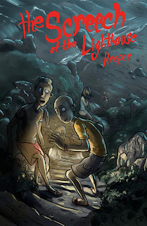
It ended up as a scene from some kind of teen mystery novel or comic, which I think was influenced by my love of horror films, but probably a likely result of watching Scooby-Doo! Mystery Incorporated a week ago. After working on it some more, on and off over a period of a couple days, I finished with the above cover idea.
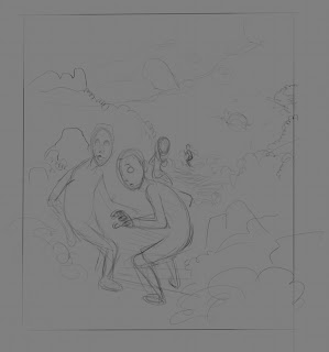
Here is the process I used in MyPaint. I made a quick rough - with a brush that I think finally feels like a 4B pencil - that sketched out the composition of the scene. I wasn't all that sure if I would continue to work on it past this point, since it was actually originally intended as a way to get warmed up.
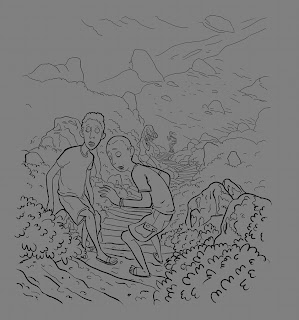
Something in it captured my eye - I think it was my surprise at the way the brush behaved - and so I decided to continue working on it. I next grabbed one of the ink brushes that I have been tweaking and tried to get a sense of the method I would like to use. I like to add detail with the "ink" instead of working it out in the rough, because I can quickly undo anything I don't like.
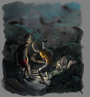
My intention was to start spotting blacks, but I realized that this wasn't probably the best choice for the image. Not to say that it wouldn't have worked - it would have ended up looking very different than this though - I just think that at this point I saw it for what it was and felt that it should be treated in a way that befitted it. A teen mystery story cover. So I started instead to block in colours and lighting. I was looking for a moonlit feeling of foreboding. I also thought that I should add in some hard highlights and decided that I would need to paint in some flash lights.
Next step was to tweak the image more by adding more visual interest. I didn't want to over complicate things here. Which I may have done anyhow.
At this point I once again decided that I should do something that I have been consciously trying to steer myself away from. Post. But once again I felt that the image needed it for what it was. So I took it into the GIMP and cropped it. I then added some new layers that I used to add overlay and multiplied colouring. And it was done. I took it back into MyPaint after this step and drew in the title and cropped it again, because the app likes to add more canvas dependant on brush stroke.
I actually had a lot of fun with this, and learned a lot from it.


No comments:
Post a Comment