
I've finally gotten the first set of images completed for "Who Needs the Moon", and I am very happy with the fruits of my labour so far. As of now, the pages are currently being hosted over on comic fury. So, if you like sequential art, why not go and take a look at what I've done and let me know what you think of the story so far.
I've learned a lot about my own work habits, tools and software working on this first portion of the book. Overall, my artistic style has kept close to what I originally envisioned, but due to time constraints and other responsibilities, the approach to polishing has taken a different turn.
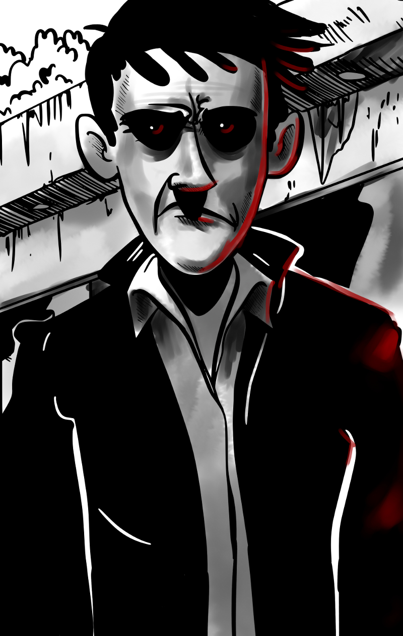
As posted here earlier, I had planned to use a few tones of grey to colour and block out the art, but have chosen to no longer go down that road. After a few pages, I was no longer happy with the result and the time that it took.
However, I do like the look of painting with grey, using blend brushes, and feel that it might be nice to paint the entire book that way. We'll have to wait and see.
For now, I need to outline, plan and write the rest of the book, so I am more certain of where it will go.
Also, I think I am going to try and see if there might be any interest out there for a publisher to work with me and publish and distribute the book.

So, for some things here and there, I am using open source fonts from the league of moveable type which have created a great catalogue of fonts for everyone to use personally and commercially. Currently I am using Goudy Bookletter 1911 by Barry Schwartz for the title pages of each chapter. There are other open font libraries that I will be looking into in the future.
There was one problem though, I wasn't very happy with the selection of comic fonts available in the open font offerings online. Because of this, I decided to make my own font, which I've called Drawn Icon and which will be licensed under the SIL's open font license when I feel that it is completed. Currently it needs some more TLC before I feel that it is truly ready for everyone to use.
Enough already I guess. Please go have a read and let anyone you think might be interested know that the start of the book is online.
Warning! Mature content, even more so in the future.
Thank you.
EDIT:
I have since removed the images from dropbox as of today March 13th 2013.
No comments:
Post a Comment