So... What have I learned while making this comic?
Well I learned that I needed to set up my comic, in such a way that it would be easy and enjoyable to read. I spent probably
too much time looking for a plugin that would allow me to do that here on Blogger. Unfortunately there isn't such a thing. At least I didn't search long and hard enough to find out if there was, and besides it looks like
Wordpress is the choice for web comic publishing.
I considered setting up a
Wordpress comic site using the plugin found at
webcomic, but there were problems presented here that I didn't want to deal with any longer. Primarily, creating a website and paying someone to host it, which in my opinion is a waste of money in this day and age and the free options available. I wanted a free solution at whatever cost (go figure, and there are costs), and wanted to do it using Blogger, but soon realized that wasn't going to work out. The images that make up your comic need to be housed somewhere, and then each page needs its own separate html link, or some kind of code that keeps track of the images to post the right one when you click the next button, or the back button, etc.
What to do?
I kept searching, I wasn't about to start dealing with html coding again. Luckily, I stumbled pretty quickly on
ComicFury.
Hallelujah!
I was worried that there would be some things that I would need to agree to that would make using a free site service like theirs unappealing. Fortunately, so far that doesn't seem to be the case. And, currently, I think anyone interested in creating a web comic should consider them. They give you the free hosting, and only ask that you place their personal advertisement on your webcomic, which you don't even have to agree to do. But... Why wouldn't you help the people helping you?
You are free to advertise there whatever you want on your pages. Obviously within acceptable limits.
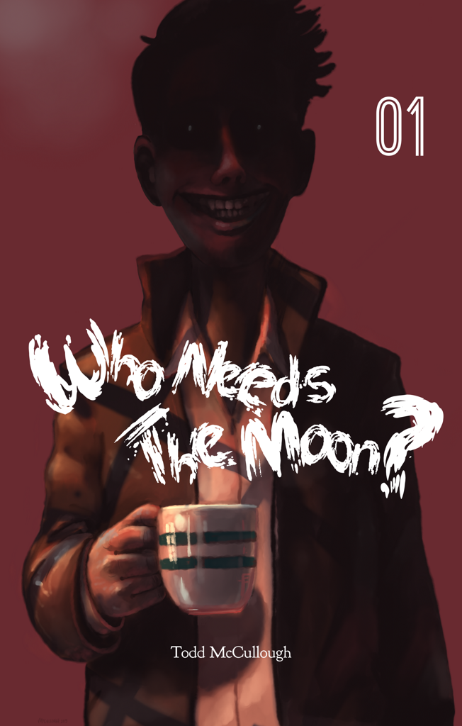
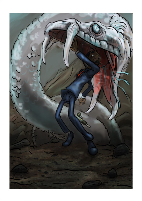
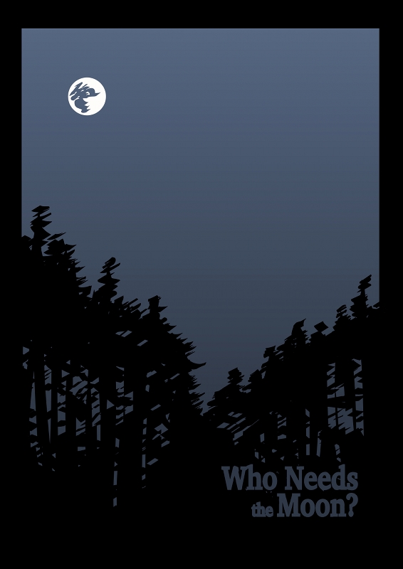
I decided to use them almost instantly, and therefore knew that I needed to get my first 25 pages completed to have it up there pretty soon. And, so I got to work. I needed a cover to place there, so viewers have something to see in the meantime, and created this after whittling down an idea into something that I could use in many ways.
I have always had the intention to print this comic sometime in the near future, and so I had a definite look that I was striving for.
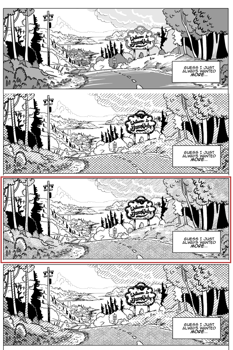
However after spending some time working with a system to speed up hatching - by basically placing a hatched image into the file as a layer, and then masking it to add and remove it from portions of the page - I discovered that it looked kind of poor when shown at a decent web size with a width of 800px. The hatching just created too many artifacts at that resolution, and these distortions were just too glaring for me. I then fooled around with line width some more and line spacing to see if it cleared it up. But there seemed to be always problems. I didn't want to make concessions on the hatching, which would look fine in print, but it looked like I would have to.
I could make each comic page larger, but I think it would ultimately ruin the user experience by forcing the reader to pan around too much. If this comic were not intended for print, I would use a layout that works better with keyboard navigation, but the intent is to print later... Anyways...
Later a decent compromise presented itself. I decided to make the masks themselves different shades of grey and this looks great on the web. Heck, it even looks good on paper I bet. What this means is that I have something that looks great on a monitor, and I am sure it either looks just as good on paper and if not I can use the layers to place the hatching when I go to print. But I am now toying with the idea of making each shade of grey a different color, because it looks great now and has opened some new possibilities. We'll just have to see.
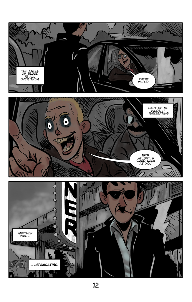
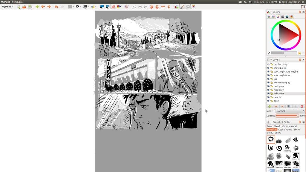
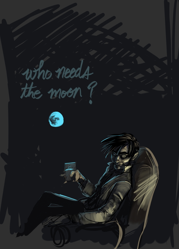
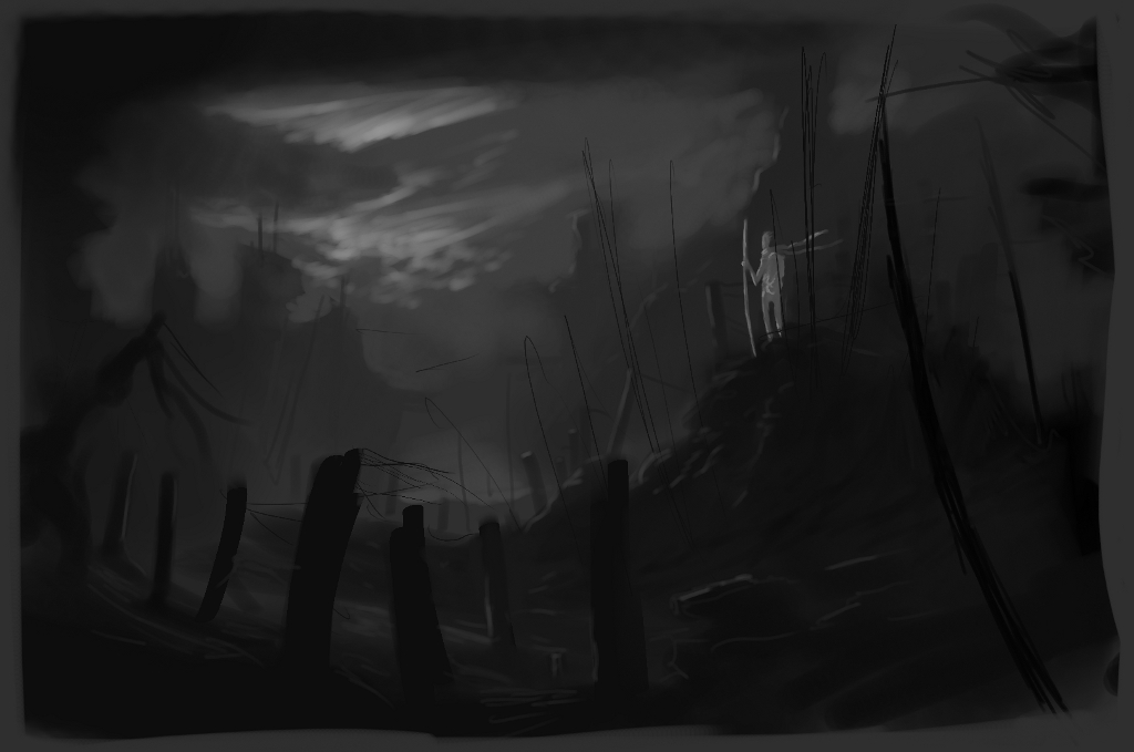
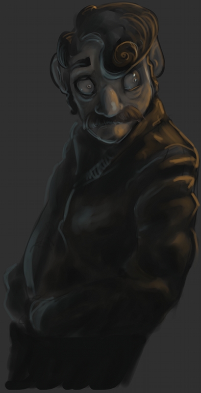
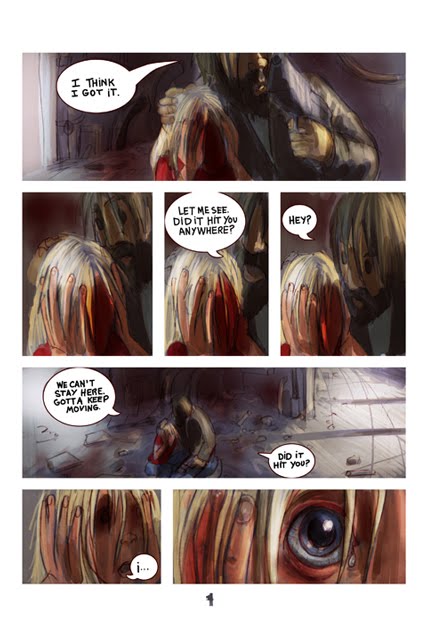
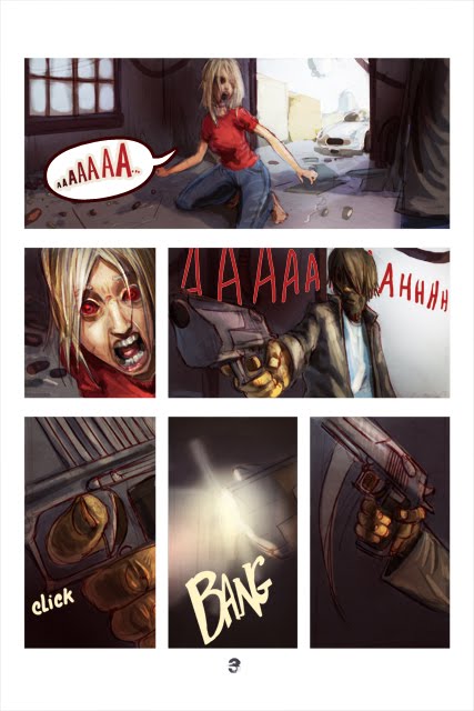
Here is a little taste of what I partly did to end up with the almost completed page 2 of my graphic novel
Pencilling, inking and painting in
MyPaint.
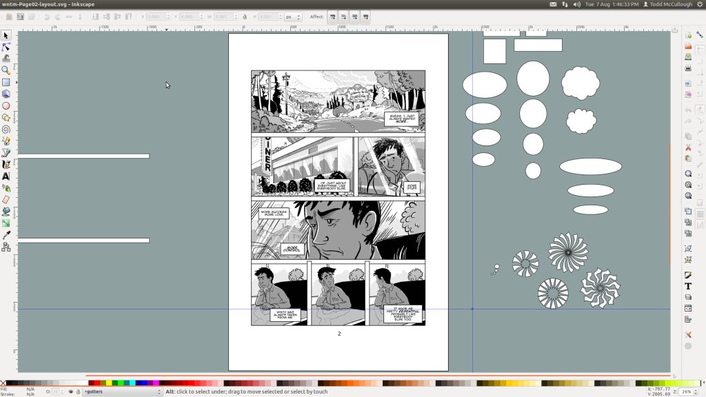
Refining the image. Once I get this process down, I hope to make better time on later pages.
GIMP for the bridge between
MyPaint and
Inkscape. Please fix the GIMP. 2.8 Crashes so often on my rig.
Inkscape to prepare the final layouts and text.