Showing posts with label process. Show all posts

Tuesday, February 5, 2013

Tablet FTW

Recently I purchased a new tablet because I heard about a nice little app called Procreate.

Unfortunately I had to purchase an iPad 4 because it was only available in iOS.

You see, I would have much rather gotten an android tablet, such as the Nexus 10, if only because I've already invested in quite a few Android apps.  I also like that there is quite a bit more freedom in Android.

The iPad does have a really good contrast ratio though and that makes it good for this sort of thing. Though not nearly as good as a decently calibrated monitor.

At first I was worried that I wouldn't make much use of it, but fortunately, I now think it was one of the best purchases I've made in a long time.


Because now I can draw anywhere, and draw the way I want to!

Here are some quick sketches done to get a sense of the whole thing.


I did use some other apps as well.  I find that I prefer roughing things out in Brushes or Sketchbook Mobile. So I have been using those apps a lot too.


Sunday, September 9, 2012

Instagram Helps Me Create

It can get very tiring working on Who Needs the Moon in the dark, dingy and unfinished basement in my house.  Well, maybe I shouldn't complain, plenty of people would probably love to have even that.

Anyways, to get my mind off the book and to procrastinate, I have been taking photos often when I am out and about with my Nexus S phone and posting a lot of them to my instagram profile.  Instagram clicked with me.  I am wishing there were either more apps like this, or more sites like this that allow users to just view images and like them.  Specifically I'd love to see something for cartooning and illustration.


I think it helps me take better photos and gets me thinking about composition and colour in unique ways. Also some places help inspire the stories inside my crazy brain, including Who Needs the Moon and my werewolf friend.

Soon, I am planning like to scout out abandoned towns and dark forests, and look for images that I can use as reference for backgrounds in the comic.

It's helped me come to the realization that I have a real thing for #skyporn and #fogporn. Alas, not much fog ever in my neck of the woods.

If you like instagram, why not take a look at my profile?
http://instagram.com/toughmccuddllo
Maybe you can follow me, and I can follow you.

BTW - instagram really should implement a webspace to view this stuff.

Sunday, September 2, 2012

I Got Ahead of Myself

Looks like I am not going to have the first 25 pages finished as quickly as I expected to.  Things should change in the next week or two though.

1) My son starts junior kindergarten next week - so that frees up daytime hours on Thursday and Friday.

2) Maybe my daughter will start going to daycare during that time on those same days - thereby freeing up more daytime hours.

3) The above should make me less off a sleep starved and sleep obsessed person who actually does something with his time in the evenings when his kids are staying with him instead of falling immobile onto a couch.

4) I am getting a better sense of the visual direction of the book - and it has made me come up with some interesting ideas for the story having these times when I can't but can work on the book.

Basically, half my time is split taking care of my two toddlers, which is the most exhausting/rewarding/stressful/empowering/difficult/wonderful thing I have ever done!

Anyways, 6 pages are 95% complete.  Just trying to decide if I should post those for now.


Tuesday, August 7, 2012

Hatching a Grey Plan

So... What have I learned while making this comic?

Well I learned that I needed to set up my comic, in such a way that it would be easy and enjoyable to read.  I spent probably too much time looking for a plugin that would allow me to do that here on Blogger.  Unfortunately there isn't such a thing. At least I didn't search long and hard enough to find out if there was, and besides it looks like Wordpress is the choice for web comic publishing.

I considered setting up a Wordpress comic site using the plugin found at webcomic, but there were problems presented here that I didn't want to deal with any longer.  Primarily, creating a website and paying someone to host it, which in my opinion is a waste of money in this day and age and the free options available.  I wanted a free solution at whatever cost (go figure, and there are costs), and wanted to do it using Blogger, but soon realized that wasn't going to work out.  The images that make up your comic need to be housed somewhere, and then each page needs its own separate html link, or some kind of code that keeps track of the images to post the right one when you click the next button, or the back button, etc.

What to do?

I kept searching, I wasn't about to start dealing with html coding again.  Luckily, I stumbled pretty quickly on ComicFury.

Hallelujah!

I was worried that there would be some things that I would need to agree to that would make using a free site service like theirs unappealing.  Fortunately, so far that doesn't seem to be the case.  And, currently, I think anyone interested in creating a web comic should consider them.  They give you the free hosting, and only ask that you place their personal advertisement on your webcomic, which you don't even have to agree to do. But...  Why wouldn't you help the people helping you?

You are free to advertise there whatever you want on your pages. Obviously within acceptable limits.

I decided to use them almost instantly, and therefore knew that I needed to get my first 25 pages completed to have it up there pretty soon.  And, so I got to work. I needed a cover to place there, so viewers have something to see in the meantime, and created this after whittling down an idea into something that I could use in many ways.


I have always had the intention to print this comic sometime in the near future, and so I had a definite look that I was striving for.


However after spending some time working with a system to speed up hatching - by basically placing a hatched image into the file as a layer, and then masking it to add and remove it from portions of the page - I discovered that it looked kind of poor when shown at a decent web size with a width of 800px.  The hatching just created too many artifacts at that resolution, and these distortions were just too glaring for me. I then fooled around with line width some more and line spacing to see if it cleared it up.  But there seemed to be always problems.  I didn't want to make concessions on the hatching, which would look fine in print, but it looked like I would have to.

I could make each comic page larger, but I think it would ultimately ruin the user experience by forcing the reader to pan around too much.  If this comic were not intended for print, I would use a layout that works better with keyboard navigation, but the intent is to print later...  Anyways...

Later a decent compromise presented itself.  I decided to make the masks themselves different shades of grey and this looks great on the web.  Heck, it even looks good on paper I bet.  What this means is that I have something that looks great on a monitor, and I am sure it either looks just as good on paper and if not I can use the layers to place the hatching when I go to print.  But I am now toying with the idea of making each shade of grey a different color, because it looks great now and has opened some new possibilities.  We'll just have to see.


Here is a little taste of what I partly did to end up with the almost completed page 2 of my graphic novel 

Pencilling, inking and painting in MyPaint.


Refining the image.  Once I get this process down, I hope to make better time on later pages.


GIMP for the bridge between MyPaint and Inkscape.  Please fix the GIMP.  2.8 Crashes so often on my rig.


Inkscape to prepare the final layouts and text.


Wednesday, July 18, 2012

Another Process Post

I've been working on the first 25 pages of the graphic novel.  After doing some research today, I may have to cut one page, depending on whether it is affordable to print the comic up smaller "montly" issues.  But, it certainly looks like print may just be too expensive to do unless it is all one volume, or if you are a major publisher that can afford to print a really large amount of issues.

So I'm pretty settled into the production process now.

Personally, I first start with a small pad of paper or notebook, where I just quickly try to jot down the story, page by page.  At this early stage, I'm not really doing much more then putting down some basic narrative, dialogue or plot ideas that map out the story.  I find it convenient to do it like this, because it's easy to carry around and work on it anywhere.


This drafting stage has been very beneficial to me.  The text is enough to remind me of what I plan on drawing in that page, and without thumbnails, it allows me to alter the mental layout of the page if it needs a different flow.


Some of this work could end up becoming scrap once I type it into the computer, using Libre Office, I've debated using google drive for this, but decided for now to keep everything on my own system.

Next I start typing the pages out into my desktop. I then print out these pages and place them all into a binder, organized into revision tabs.  This way I can again easily edit then anywhere, marking out and revising narration and speech.  I can also figure out if a page needs to be broken up into more pages, and start the thumbnails while I edit.

Although it is all maybe a little time consuming, I think it is actually extremely beneficial, and so I will continue to force myself to do it.  The best laid plans are well thought out in advance.


Once things are starting to make sense and I am ready to start making the pages, I first create the layouts for every page in Inkscape.  I then work with MyPaint to sketch the pages and then the GIMP to bring it all together.

So below, you'll see the basic roughed in page, with crude images to get a sense of placement. Just blocking in at this point.

 After I am happy enough with the rough images, and all the pages are roughed out. I then move on to tightening up the images.  For me, this has been where the look of the characters has started to be fleshed out more.  I've tried to sketch some of the supporting characters, but with little success, because it just feels out of context, and it seems I need the story and panels to really feel it all.
Some of the panels require the use of a the background being repeated.  So for this I've decided to just duplicate the "pencils" of the background into each panel with the GIMP.  Later I'll free hand the "inks" of each panel separately, to give each a unique visual stamp.
I hope to have the first 25 and the cover up by mid August. Hopefully I can hit that mark, and - fingers crossed - people read it.

As an aside, making a living as an artist is not all it's cracked up to be.  

Has it ever been?  

While I wouldn't say I'm starving - my kids aren't currently going hungry either - it would certainly be nice to have some more money to get a little more out of life.

Sure, I could always look for work with another company - which I have done in the past, and would certainly take any current proposals! - but the reward of creating my own personal artistic vision is too enticing to stop striving to do this book and any other project I choose to create.


Thursday, June 28, 2012

Sharing my Comic Template

Hi there. I have something that may be of use to some of you out there.


Here is the TEMPLATE.

Tonight I have started working on the layout of the first 25 pages of my book Who Needs the Moon.
Once it's ready I will be putting it online here for you to read in the new page that I will be opening up soon on this blog.

To create the book, I will be using Inkscape to do all the borders, speech balloons and text for the comic.  I think I have found a document size that works well for printing, and which can be shrunk down in order to be placed on the internet.

If you want a comic template to use, you can use this one until your hearts content and not have to worry about paying a fee to me or giving me credit.

I hope it saves you some time.

As I work on the book more, I'll add things as I need them and will update the file and link.


NOTE: The values of the template were sort of arbitrarily chosen. It is sort of a mix of industry sizes. I mainly measured out sizes from different graphic novels that I liked and then chose one for myself. This is not a template that conforms to marvel/DC or Manga standards.

Tuesday, June 26, 2012

The Screech of the Lighthouse Keeper

So I wanted to practice and work on my inking in MyPaint some more. So I started a quick doodle which led to this...


It ended up as a scene from some kind of teen mystery novel or comic, which I think was influenced by my love of horror films, but probably a likely result of watching Scooby-Doo! Mystery Incorporated a week ago. After working on it some more, on and off over a period of a couple days, I finished with the above cover idea.

Here is the process I used in MyPaint. I made a quick rough - with a brush that I think finally feels like a 4B pencil - that sketched out the composition of the scene. I wasn't all that sure if I would continue to work on it past this point, since it was actually originally intended as a way to get warmed up.


Something in it captured my eye - I think it was my surprise at the way the brush behaved - and so I decided to continue working on it.  I next grabbed one of the ink brushes that I have been tweaking and tried to get a sense of the method I would like to use. I like to add detail with the "ink" instead of working it out in the rough, because I can quickly undo anything I don't like.


My intention was to start spotting blacks, but I realized that this wasn't probably the best choice for the image. Not to say that it wouldn't have worked - it would have ended up looking very different than this though - I just think that at this point I saw it for what it was and felt that it should be treated in a way that befitted it. A teen mystery story cover. So I started instead to block in colours and lighting. I was looking for a moonlit feeling of foreboding. I also thought that I should add in some hard highlights and decided that I would need to paint in some flash lights.


Next step was to tweak the image more by adding more visual interest. I didn't want to over complicate things here.  Which I may have done anyhow.


At this point I once again decided that I should do something that I have been consciously trying to steer myself away from. Post. But once again I felt that the image needed it for what it was. So I took it into the GIMP and cropped it. I then added some new layers that I used to add overlay and multiplied colouring. And it was done. I took it back into MyPaint after this step and drew in the title and cropped it again, because the app likes to add more canvas dependant on brush stroke.


I actually had a lot of fun with this, and learned a lot from it.


Friday, May 25, 2012

The Search for a Solution

With my wife still fighting back breast cancer - and doing very well - I have very little time to work on the graphic novel while juggling care for her and care of our two children.

A few weeks back though, I managed to squeeze out a little time here and there and started to tackle what process I would be taking to complete the book.

I have ruled out ink and paper, and have instead chosen to work in digital completely.  I think it will keep my initial costs down, and it will allow me to easily tweak composition and quickly fix mistakes.

Although I do have more of an affinity with ink and paper - it really just flows better and feels more natural - I think with the tests I have done, I have found a way that should still work well and produce a book that I can be proud of.

It will be created fully and only with FLOSS applications.  In the time that I have spent working in digital media, I have come to the conclusion that creating digital art should not cost a middle class fortune. The prices charged for "industry" software is outlandish, and only suppresses a large group of artists around the world from creating, or instead forces them to pirate the programs.

So, currently the process might be a little troublesome for an artist, because there is a lot of back and forth between programs.  In the long run though I think it will improve with the software and once I figure out a rhythm.

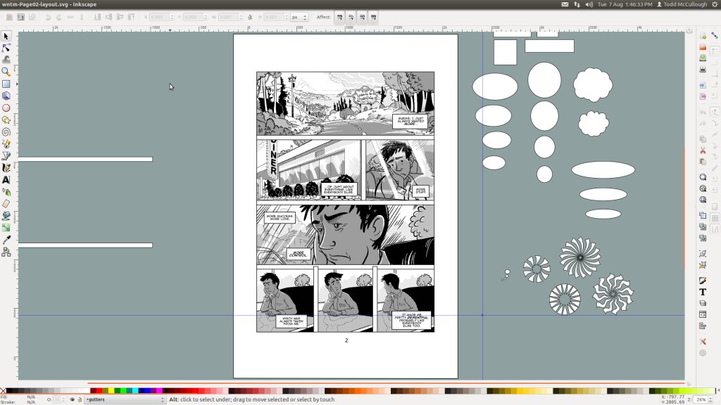
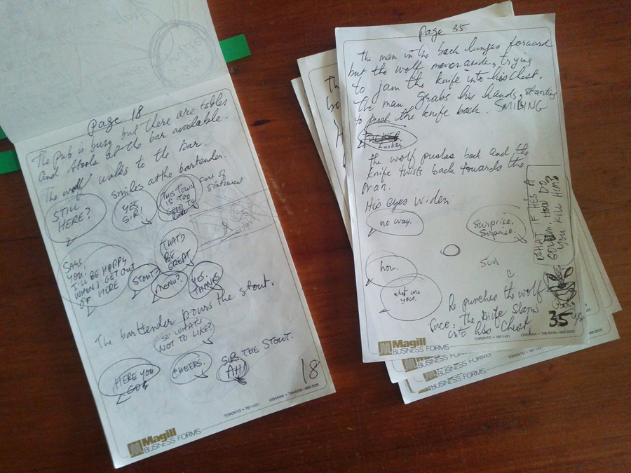
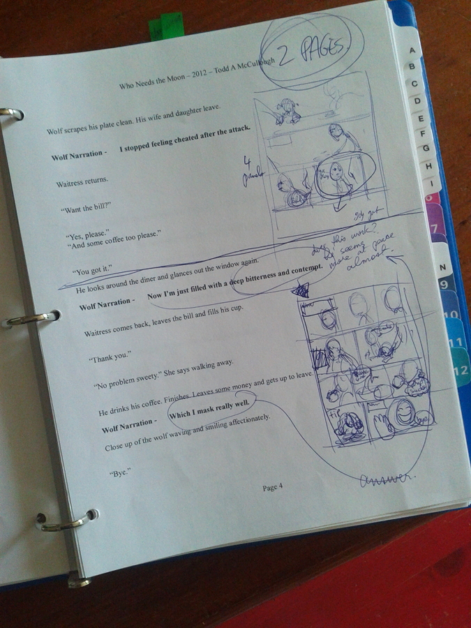
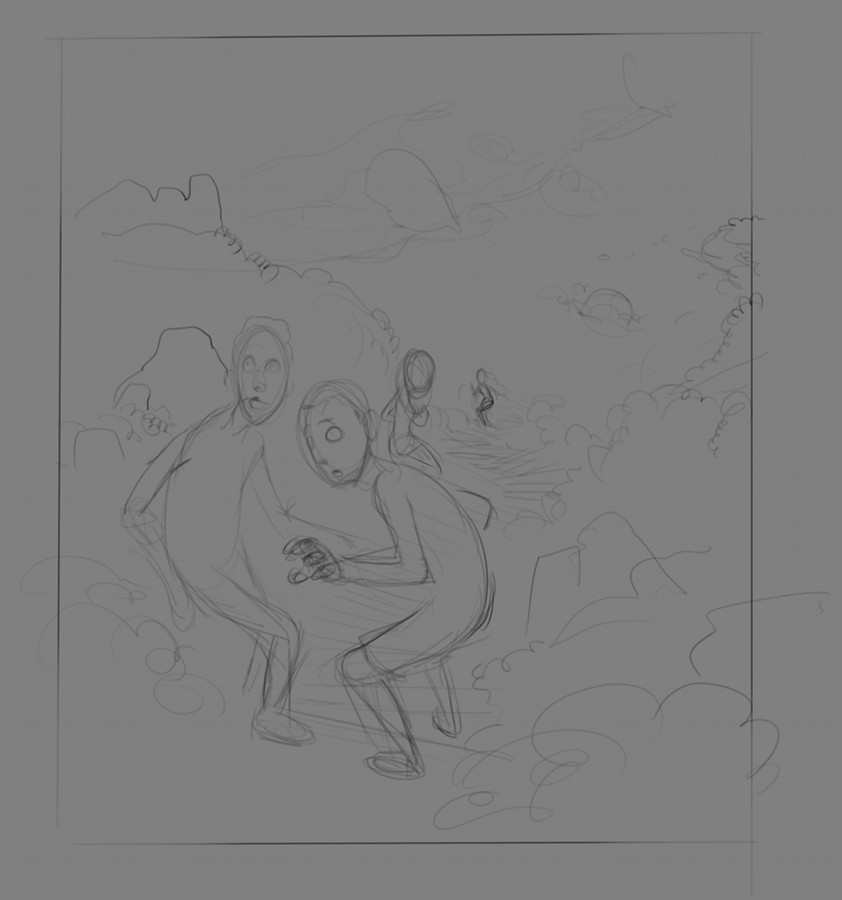
To date, I am still really only in the process of fleshing out the book.  I don't want to waste time with panel ideas and layouts. I just want to spend the time now to map the story out, get a feel for the location and characters and make the dialogue real and the narration have a decent flow to it.

What I have so far, is rough pages on individual sheets of paper in a notepad. I have then taken and entered the text into Libre Office and started to write it out - again each page on a seperate sheet - so I can then print it off, read over it and edit it some more. Each printed page has space where I can then start to layout the pages, panels, composition and dialogue in doodle form.

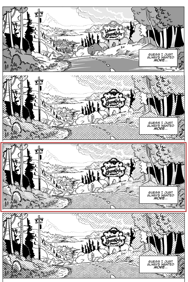
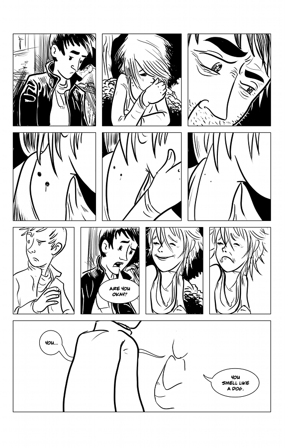
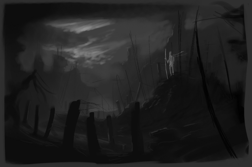
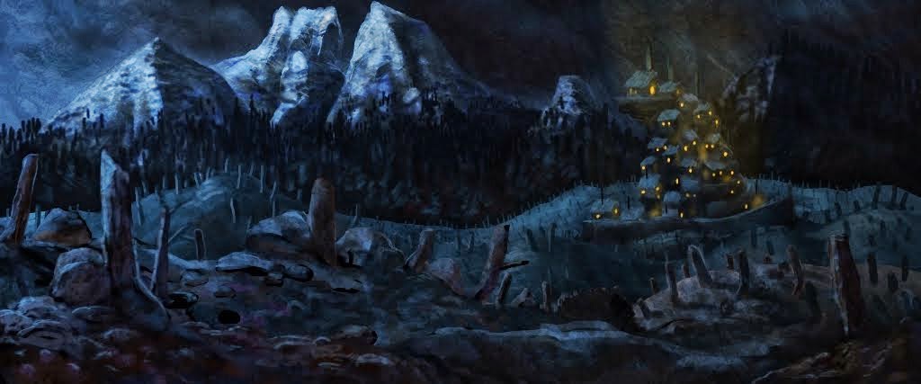
Initially I was planning on doing a colour book, and I wanted to go for a more realistic approach to the art. But the more indie comics I have read of late have only convinced me that the whole approach of having iconic characters in black and white helps the reader flow better through the book and story. I do not want the reader to stall on an image because they can't figure out what is going on, and therefore break their immersion in the story.

Also I believe it is cheaper for someone like me to print up black and white pages over full colour.  Besides there is beautiful design aesthetic to black and white images. Done right, when I see it in other peoples work, there almost appears to be a perfect balance on the page.  Truly a yin and yang thing.

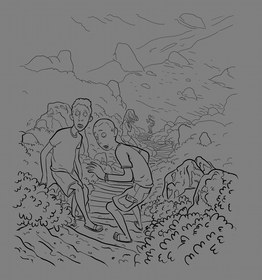
So below, you'll see an attempt done recently using two fantastic programs, Inkscape and MyPaint to try and turn out what a finished page might look like. I say might, because I haven't even gotten into character designs yet, and I am completely new to spotting blacks. So this MAY be representative of what the finished product will look like.

Based on the template that Scott McCloud made and shows off on youtube, I created something similar in inkscape. Using my doodles on the written rough of the page, I create the layout and then export out a bitmap that I then do the "pencils" and "inks" in mypaint.

I hope to make a worthwhile template that I will share with others when it is completed.
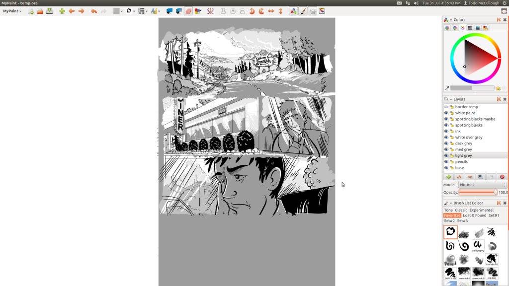
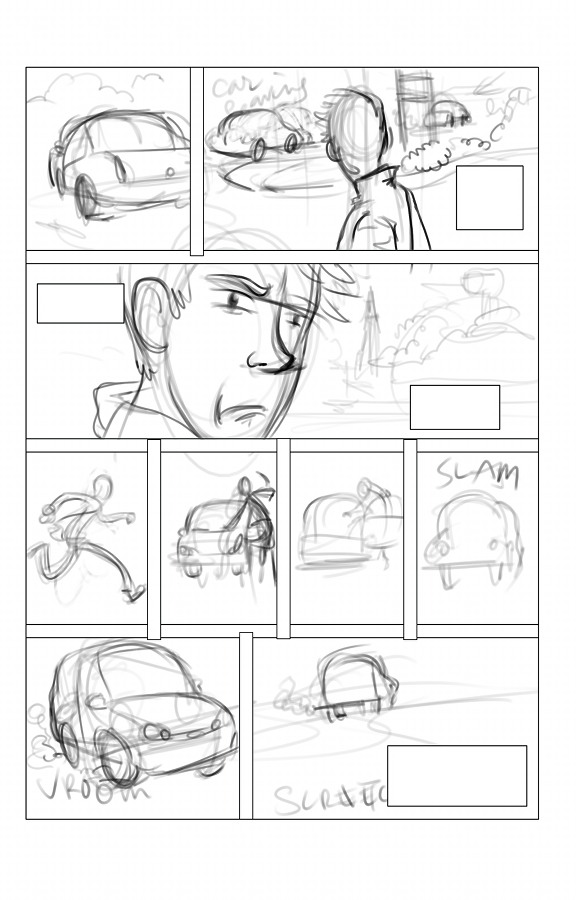
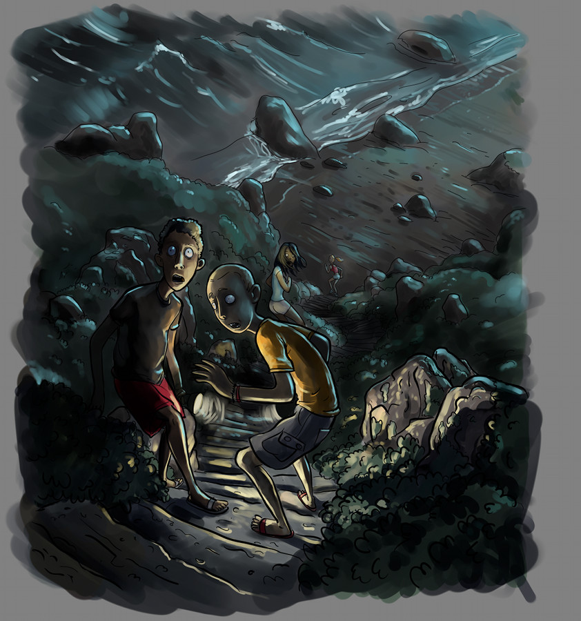
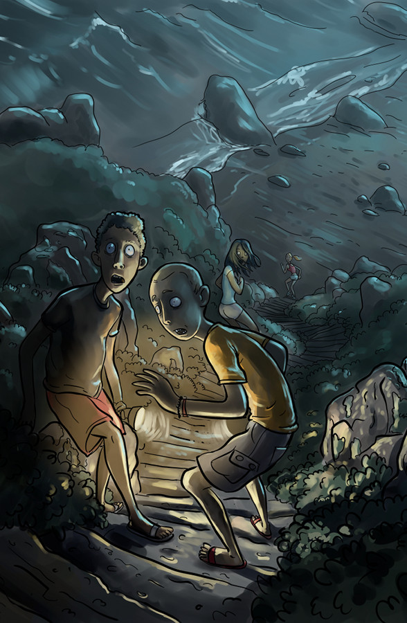
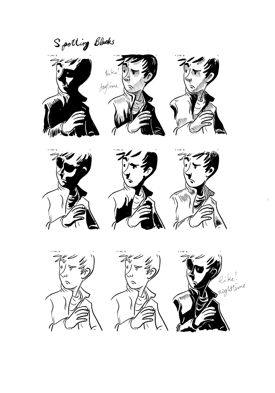
Overall I am pleased with the current result. I do feel like I have a lot of work to do on spotting blacks. It just isn't a natural process for me yet.  Which brings me to the study I did below. I just wanted to see what looks "good".  I wanted to do more, but family duties forced me to put it on hold again.  I think the next exercise I do will require a more complicated scene.
I am waiting to try out the GIMP and Krita for this as well though.  There is something about mypaint that just seems to make it more geared to painting for me and not inking.  I fooled with Krita a bit with doing some inks and really enjoyed the way it seemed to flow.  But my old wacom died, and currently neither GIMP nor Krita work with my new Monoprice 12x9 graphics tablet (which is kickass and cheap), and Krita needs to iron out some interface issues, and the new GIMP was just released, and until it works with my tablet I can't even test it out.

Mypaint does work OUT OF THE BOX with my tablet though - I guess they use their own drivers or maybe its magic - so I'll continue to use it. And I really do love mypaint.

Ink and paper aren't out though. I've decided that I would like to do posters or illustrations a little more traditionally. My eyes need a break from monitors here and there. :)

Wednesday, March 7, 2012

Sympathy for the Devil


Well, it has been difficult to find time to work on anything related to the graphic novel, let alone any other type of art.

Currently, with my wife working her way through chemo therapy to fight breast cancer, I find that the whole family is strapped for time. Because of this my duties have increased taking care of the house, her and the kids and so I don't have much time for anything else.  When I do have some time at night, I find myself completely exhausted.

Right now I am REALLY tired. I've never been this tired. @_@

For a while there, early into her treatment, art seemed pretty trivial, when faced with the all the things cancer heaps on a family. Naturally I guess I've shied away from it, and so things have been left by the wayside. Probably for the better. I've stewed on design and story ideas.

Lately though, I've been making a more serious attempt to do something... anything. I really want to create this book.

Anyways.

I was never entirely comfortable with the look of the werewolf.  An American Werewolf in London's creature effects has had a huge influence on my design ( I love that film ) but I want to inject my own take and style on it. These concepts come from me trying to nail down something.

The whole character of the wolf needs fleshing out. And the town too.

More to come. I hope.

Thursday, November 10, 2011

Experiments in Design and Composition

So I am fooling around with design and composition. At the very least I am trying to wrap my head around it better.

For some reason I seem to be up against a brick wall with the Lampy short, and so I've been working on other things as an escape from the circles in my thought process.

I just can't seem to make up my mind on where to take it. I could just go ahead and create a silly action short that consists of a fight between Lampy and Bubba, but I don't feel that I would be very faithful to the world that I am trying to create for them, and I doubt anyone would even take notice.

There is a deeper experience to Lampy that I would like to bring out. It's not immediately apparent on the surface, but I think that it is worth striving towards.


As for the werewolf graphic novel(OH! hoity toity), I think these little exercises will help get me into a frame of mind over time to help me tackle that story better too.

These following two images are poster doodles. I was just blocking out strokes on the computer - hoping something interesting would pop out that I could pounce on and take somewhere.

This is what came about of that. I didn't bother with any kind of standardized poster size. Maybe these look more like old book covers. At least that is what I am starting to see while posting this.


These two "thumbnails", or at least what started out as thumbnails, were me working through the FPS ideas that have been floating around in my head for some time.

Again not really trying to do accomplish anything except rip something creative out of my head.


I stuck with gray scale in these images because I didn't really want the hassle of trying to figure out colours. To be honest I think my eye for colour can be somewhat lacking, so this was really an exercise in composition, dramatic tone and narrative.


These were all done using the super awesome, free and open source painting program called MyPaint.

Friday, February 4, 2011

Spread the Open Source Love

Here is a screenshot of blender in action with work created by me.


So it's come to my attention that I should probably let people know what apps I use.
If you happened upon this blog, you might be under the impression that I use expensive software to get this done. Maybe you think, he should have!

I used to, when I worked for other people. And I imagine, should I get hired on full time again, I'll be using it again.

But it doesn't need to be that way.

I currently work with open source software.

All 3D work I do is done in the amazing program provided by the Blender Foundation.

BLENDER


All digital paint work I do is done with the awesome, MyPaint.

MyPaint


All image manipulation work I do is currently done using the GIMP. It needs help to get to the next version!

GIMP


All virtual lighttable work I do, is currently done using Darktable.

DARKTABLE


Video Editing is done using Kdenlive.

KDENLIVE


Openshot looks promising though.

OPENSHOT

And yeah. I work in a free operating system environment.

UBUNTU

But there are other nice looking linux distros out there that are starting to catch my eye.


Alchemy

Harmony

great sketching tools. Which you may already know about.

Saturday, January 15, 2011

Background Painting

This is a fairly quick background painting, for my toony short. The buildings are almost placeholder because I may want more details as I zoom in.


I'm trying to figure out what process I'll be going through in order to complete my short. I am also trying to figure out how I will be working on things in the future. It looks as though a good mix of 3d and 2d is a great way to work on things when you work alone.

Tuesday, May 25, 2010

Fooling With Styles

So...
I'm developing a graphic novel and at this current point in time I've produced 3 pages.

You'll be able to read it here. Free.

It will most likely be considered a horror book, but I hope that it comes across more as a study of a man.

I was recently very inspired by the works of Yoshihiro Tatsumi and his inspiring ink work. I've pretty much decided that I want to go in the same direction with my own book.

There is something deeply traditional in reading black and white ink work on paper that I feel can really make the reader connect more deeply with a book.

I think it was something I loved about Jeff Smith's Bone and Jim Woodring's Frank too. There is just this sort of simple graphic appeal to the contrast between black ink on paper.

That's not to say that I am not inspired by colour works though. Ben Templesmith's art is very moving too.

Below I sort of did a quick monochromatic experimentation with his work as inspiration to test the waters.

What do you think?

Sunday, May 23, 2010

My Weapons of Choice


So I thought I'd start things off by showing you what I have been using to make comics with recently.

I've tried quite a few things over the last few years and read about what others are into using.

For me though, this seems to work best for now.

The 3H is used for roughing in the page and figuring out the details.

The Chinese brushes are for any wet ink work I plan on doing. Or maybe if I plan on doing watercolour for illustration purposes.

The Copic Sketch marker is my true work horse, I guess. Pretty much 85% of the line work I do is currently done with it. I love the variable widths I can get with the brush tip. The Copic marker is for borders and any sort of detailing I want to do with less variable width.

The Marsmatic700 is for text and fine details. The Uniballer is for fine details and cross-hatching. I am probably going to replace it with a finer pen tip for the Marsmatic.

And for filling in black areas, I've decided to stick with my Pilot Super Color markers that I use in my fine art work. They stink and it might not be the best for my head, but I love how utilitarian they are.

I'm happy with these right now.